In a series of blog posts, Gary Rubinstein attempts show that the Value Added Modelling scores recently released by the NYC Department of Education prove that VAM (Value Added Modelling) is not accurate.
However, whatever flaws VAM may have, Gary Rubinstein (henceforth GR) hasn't demonstrated them. All he has demonstrated is why you shouldn't use scatterplots.
In his series of blog posts, he claims that intuition predicts certain correlations should be present between different sorts of VAM scores. He then uses visual inspection of scatterplots to assert that this correlation is not present. For example, in his first post, he examines the relationship between a teachers VAM score in one year and their VAM score in the next year:
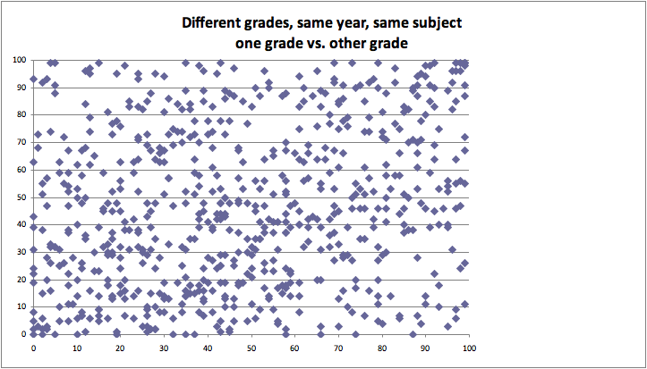
He also plotted the VAM score of students of the same teacher, but from two separate classes:
Looks pretty messy, hard to see much correlation there.
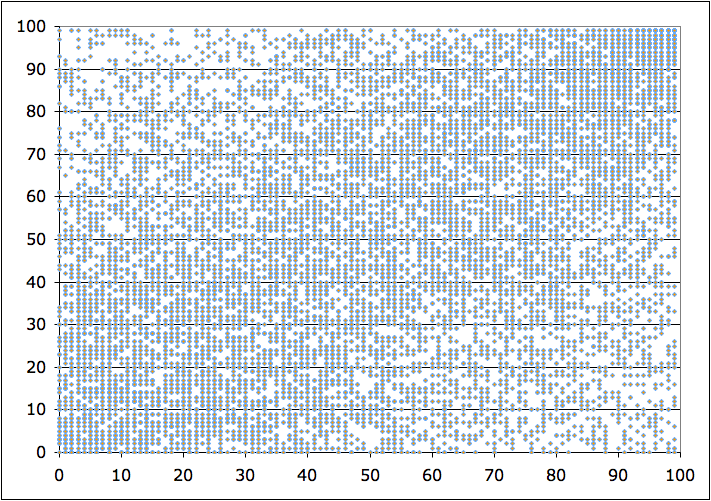
What's also very strange is that in this picture, all the data points seem to line up. It turns out that when we inspect the data file, all the percentiles were truncated to the nearest integer. So it's actually possible that we might have multiple teachers with data points occupying the same pixel!
This creates the visual artifact called truncation. A scatterplot can only visually represent density up to a certain threshold - the threshold of "points everywhere". In at least some parts of this picture, specifically the bottom left and top right corners, we seem dangerously close to that point.
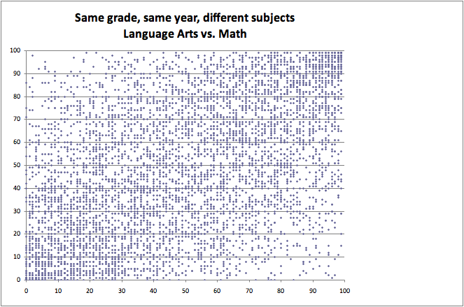
GR also measures the VAM scores of the same teacher, but teaching the same class to two different grade levels:
Still messy, no obvious relationship. Again we see the phenomenon of visual truncation, this time caused by the large tick size. At many points of the graph, multiple ticks overlap each other, which makes the visual density appear lower than it really is.
Plot density, not points
The solution is to plot the binned point density rather than the points themselves. We already know this method in one dimension as the histogram.
In two dimensions, there are multiple ways of doing it. The bin shapes can be taken from any method of uniformly tiling the plane, such as squares or hexagons. For each tile, the number of data points inside the tile are counted. The tile is then assigned a color according to the number of points.
I'll demonstrate a density plot using the hexagonal tiling, since matplotlib has the hexbin function. I applied this hexbin function to GR's data comparing teachers across multiple school years:
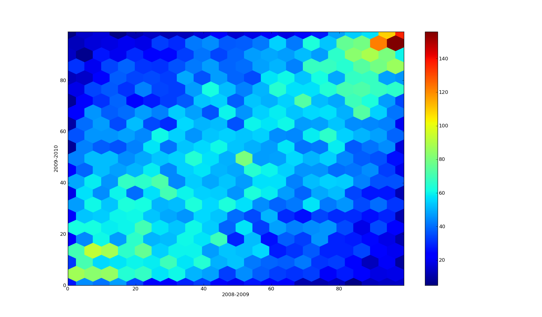
Looks like a pretty clear relationship. It's noisy, but present. More importantly, it's far easier to see in a hexbin plot than it is in a scatterplot.
(Side note: GR also plotted a strange data set. He compared the same teacher, but across different subjects and grade levels. Based on this, he got a correlation of 0.3. The relationship strengthens to 0.4 when you compare the same teacher teaching the same subject at the same grade level. But I'll ignore this - this is a blog post about why scatterplots suck.)
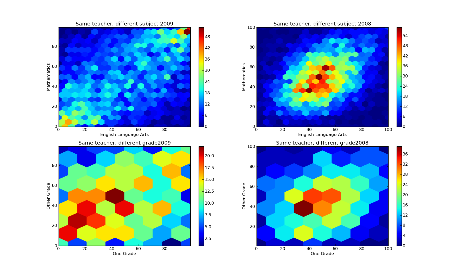
The left two columns are GR's data, but redone with a density plot instead of a scatterplot. The right two columns are the same plots, but for 2008-2009 instead of 2009-2010.
The top two plots display the density of VAM scores for teachers who taught different classes to the same grades. I chose a gridsize of 20 since we have 5319 and 5553 data points (respectively). In the density plot, it's pretty easy to see the data clustering along the line y=x. The correlation coefficient of 0.50 suggests the relationship probably is pretty strong. So teachers who are good at teaching math are also good at teaching english.
VAM passes this common sense check with flying colors.
The bottom two plots display the density of VAM scores for teachers who taught the same class but in different grades. I chose a gridsize of 7 since there were very few data points (only 742 in 2008-2009 and 769 in 2009-2010). GR's plot displays 2009-2010, so it is directly comparable to my bottom left plot. It's a bit messy, but there is certainly a lot more data near (0,0) and (100, 100) than there is near (0,100) or (100, 0). The correlation coefficient of 0.22 suggests there is a relationship, albeit weaker (but this could be an artifact of having little data). It looks like teachers who are good at teaching one grade are also good at teaching another. The correlation is weak (0.22), but present.
It's tough to say whether VAM passes this check. The correlation is certainly there, but it's not that clear. On the other hand, it could just be due to having too few data points.
So all told, it looks like Gary Rubinstein was wrong about NYC's teacher evaluation method. Value Added Modelling holds up to his high standards, he just didn't realize it because he made some bad graphs.
Conclusion
Don't use scatterplots. Use a density plot such as a hexbin instead.
Also, go read the hacker news comments, some of which are excellent.
Edit: Some people seem to be interpreting me as making a stronger claim than I intend. There are obviously a few cases when a scatterplot truly is the right tool. My claim is that they are sufficiently uncommon that you should make a density plot your default tool, and use the scatterplot only in the rare cases when you truly aren't looking to demonstrate a density.
Source code
Only source for my plots, I think his were made in Excel.