I recently saw a post on the Freakonomics blog in which Justin Wolfers harshly criticized John Taylor's blog post which reported a strong correlation between investment and unemployment:
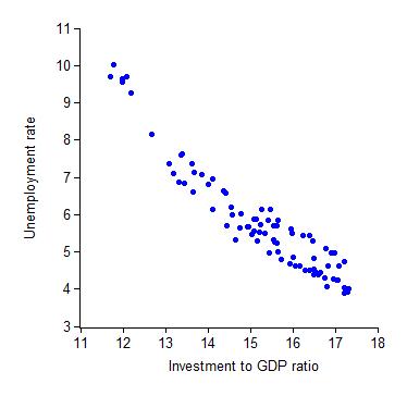
The criticism raised by Wolfers is that Taylor only looked at data from the 1990's. This is a very fair criticism. Taylor should, at the very least, have pointed out that the correlation is much less visible (if it's present at all) for all data post 1948.
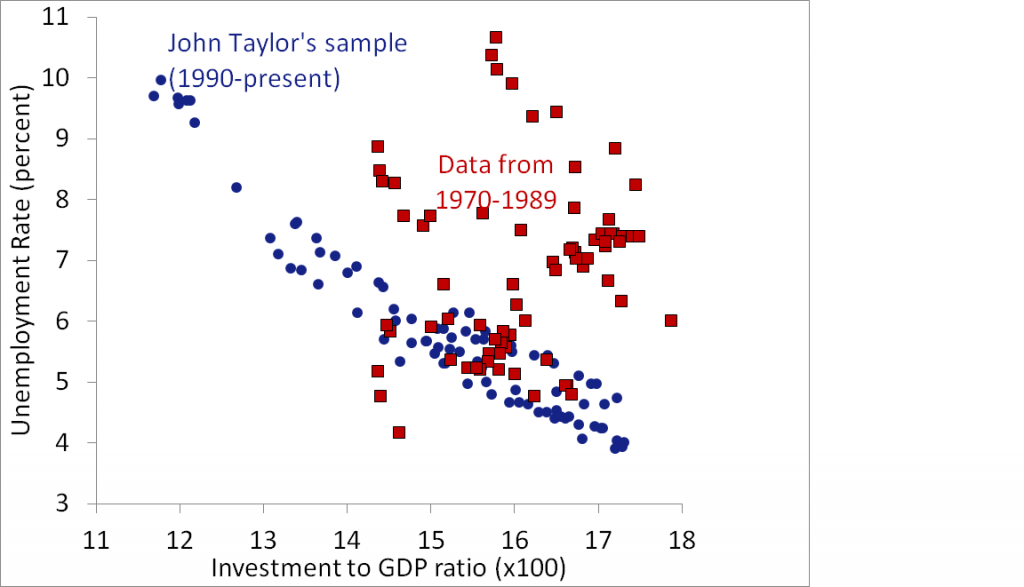
When you include data from the 70's, you observe this:
And when you look at the full sample (1948-present), you observe this:
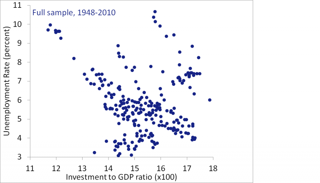
An interesting fact about the second graph is that most of the data from 1948-1970 actually does match up pretty well. It's mainly just the 1970-1989 data which is causing problems.
This got me curious, and I decided to take a different tactic. I don't like looking at unemployment. It's a rather fickle quantity, and the natural rate of unemployment has almost certainly varied over the past 60 years with the changing face of employment. So instead of graphing unemployment vs investment, I decided to examine employment vs investment.
I discovered a rather interesting structure in the data. There is indeed a significant positive correlation between investment and employment from 1948-1980. Starting at roughly 1980, this correlation vanishes. The relationship between investment and employment becomes flat, as employment increases while investment is held constant. Then, from 1990 to the present, a nearly parallel relationship appears, but shifted to the right.
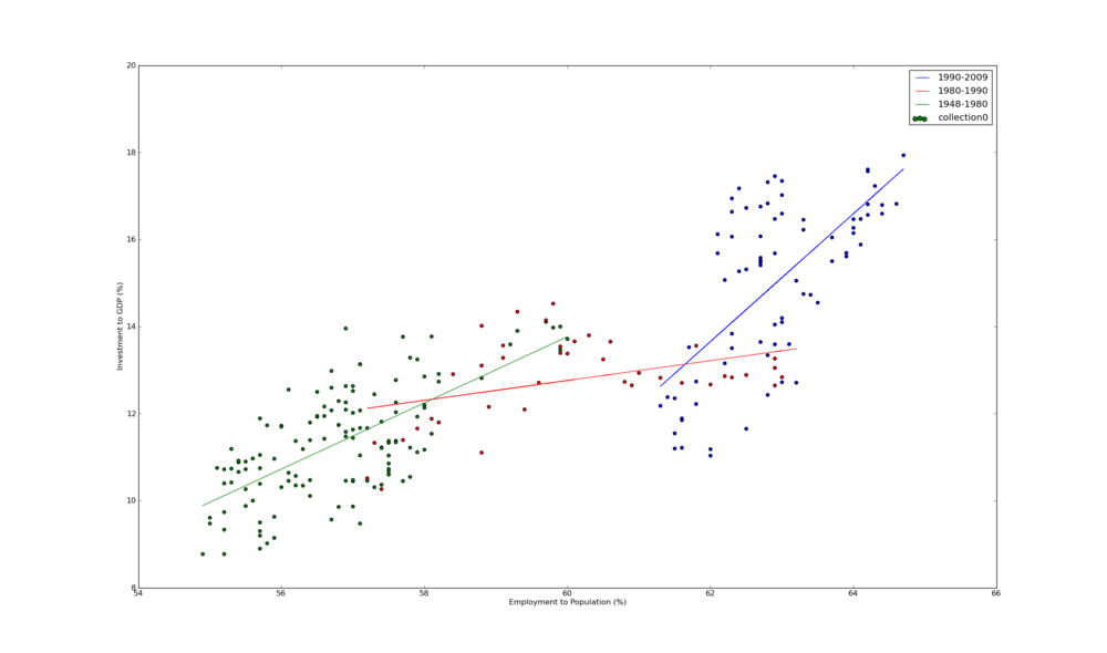
My theory as to what is happening here? Investment is strongly correlated with employment. I won't speculate as to the direction of causality. But during the 80's something weird happened. Not sure what, but I imagine women are to blame. This exogenous event shifted the investment/employment curve to a higher level of employment. After this event concluded, the original relationship between investment and employment took over again.
Source code is available here. Data used came from here: EMRATIO, GDPI and GDP.